Big Brand’s Re-Brands…
Moving with the times
As businesses grow, develop and evolve over time, branding needs to adapt and mature with them. Logos that would have been designed in the 80’s, 90’s and even 00’s will now be decades old and won’t reflect the company in this day and age.
Some companies go for a whole new look across their product range, while others may just change their logo font, update the colour scheme or simplify existing shapes or imagery.
We have put together a small list of big company’s recent re-brands that we have come across:
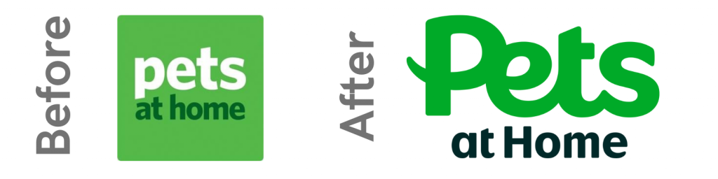
Pets at Home
A subtle but impactful change for Pets at Home, keeping their trademark green colour scheme. They have updated their type face to modernise their brand. This is coupled with bringing their sub brands, Vets for Pets and The Groom Room, more in line with the main logo.
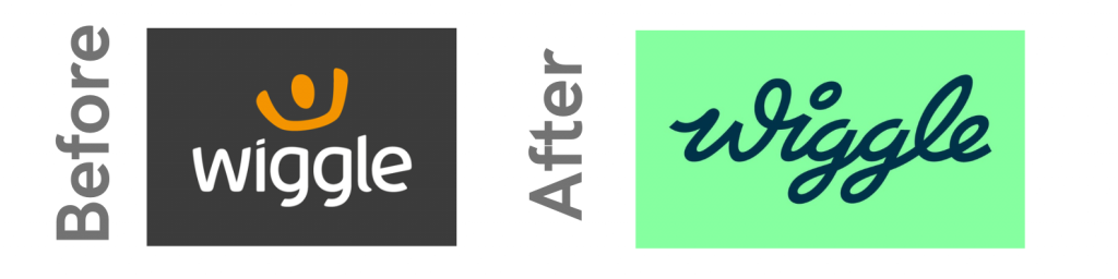
Wiggle
A vast change for Wiggle in 2023! A completely new colour scheme was rolled out on their ecommerce website this year, with a new font too! Wiggle’s owners, Chain Reaction Cycles brand also went under the digital knife in 2021, unveiling their new colourful look.
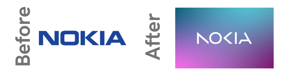
Nokia
A well known brand, Nokia have unveiled a new, modern take on their logo to complete in the ever changing tech industry.
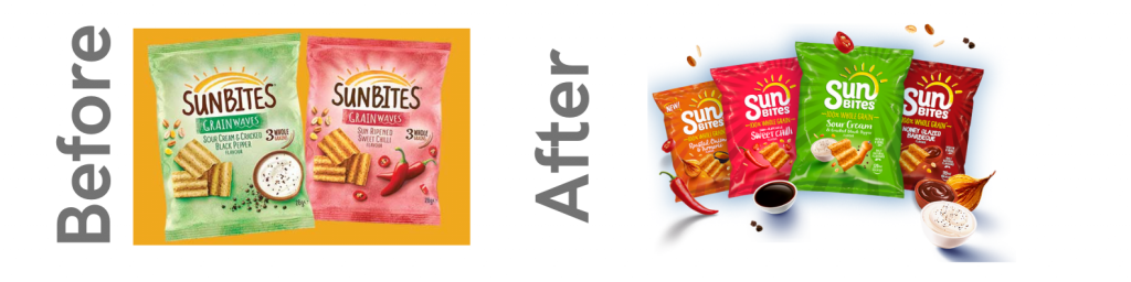
Sunbites
A firm favourite amongst supermarket shoppers, the crisp company updated their packaging with a new font and layout. They have also used a brighter colour pallet for their flavour options.
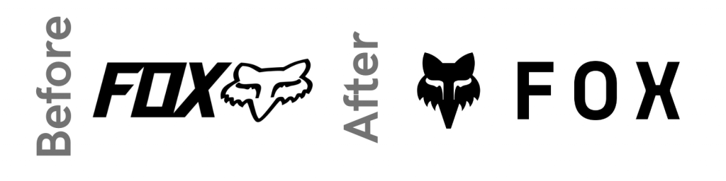
Fox Racing
In 2022, Fox Racing updated their iconic brand. Previously both the font and fox imagery were italic, whereas the new logo shows both icon and type face bolt upright with much more spacing and a narrower face head.